SaaS UX Audit: What to Check Before a Redesign
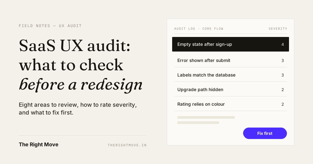
The short answer
A SaaS UX audit is a structured review of a live product that finds where users get stuck, rates each problem by how much it hurts, and turns the list into a fix order. Run one before any redesign. One reviewer alone finds about 35% of usability problems, so pair the review with real sessions and your analytics.
Key takeaways
- An audit answers "what is broken and how badly"; a redesign answers "what should it look like". Do them in that order.
- Most SaaS friction hides in eight places: first run, navigation, core flows, states, forms, upgrade path, feedback and accessibility.
- Rate every problem on frequency, impact and persistence, then fix the most severe problems on the busiest flow first.
- A single reviewer catches about a third of usability problems; three to five reviewers, or one reviewer plus five user sessions, catch far more.
- The audit is only finished when the fixes ship, which is why the person who audits should be able to build.
A SaaS UX audit tells you why a live product is not converting, activating or retaining before you spend a quarter redesigning it. Most redesign briefs start from how the product looks. Most of the problems sit in how it behaves: the first screen after sign-up, the empty table nobody explains, the error that appears after the form is submitted.
This guide covers what a SaaS UX audit is, when you need one, the eight areas to check, a six-step process, how to decide what to fix first, and how I run audits at The Right Move.
What is a SaaS UX audit?
A SaaS UX audit is an expert review of a live product against usability principles, your product data and real user behaviour, ending in a ranked list of fixes.
It usually combines three inputs:
- Heuristic review. A reviewer walks the product against an established set of principles. The most used set is Jakob Nielsen's 10 usability heuristics from Nielsen Norman Group.
- Product data. Funnel drop-offs, activation rate, support tickets and app reviews. These tell you where people stop.
- Real sessions. Watching a handful of people try the core task. This tells you why they stop.
The output is not a slide deck of opinions. It is a list of specific problems, each tied to a screen, a principle, a severity score and a proposed fix.
When should you run a UX audit instead of a redesign?
Run an audit first whenever the product is live and something is underperforming. A redesign without an audit is a guess with a bigger budget.
Common triggers:
- Sign-ups are steady but few users reach the first useful result.
- Support keeps answering the same "how do I…" questions.
- An enterprise prospect is coming for a demo and the admin view has never been reviewed.
- You redesigned once and the numbers did not move.
- A new product lead has joined and needs a clear picture of the product's debt.
One benchmark is worth knowing. Across 62 B2B SaaS companies, Userpilot's 2024 benchmark report put the average activation rate at 37.5%. Treat that as a rough guide, since it comes from a product-analytics vendor's own customers, but it shows the scale of the problem: most new users never reach value. An audit tells you which step loses them.
What should a SaaS UX audit check?
A SaaS UX audit should check eight areas, starting with the flows that carry the most users and revenue.
| Area | What to check | Signal in your data |
|---|---|---|
| First run and activation | Does the first screen after sign-up lead to one clear first result? | Low activation, long time to first value |
| Navigation and structure | Do labels match how users name things, not how the database names them? | Search used for basic pages, "where is…" tickets |
| Core task flows | Can a new user finish the main job without help? Count the steps. | Drop-off between flow steps |
| States | Are empty, loading, error, no-results and long-content states designed? | Tickets that start "it just shows nothing" |
| Forms and input | Is validation inline? Are errors shown before submit, not after? | Form abandonment, repeated submits |
| Plans and upgrade path | Can users see what they get, what they are missing and how to upgrade? | Low trial-to-paid, pricing page exits |
| Feedback and trust | Does the product confirm actions, show progress and explain numbers? | "Did it save?" questions, double clicks |
| Accessibility and devices | Does meaning ever depend on colour alone? Does it work at phone width and with a keyboard? | Mobile bounce, complaints from larger accounts |
States deserve special attention. They are the screens nobody demos and every user meets. I wrote more about them in SaaS dashboard design, where empty and error states decide whether a dashboard gets used.
How do you run a SaaS UX audit, step by step?
You run a SaaS UX audit in six steps: set the goal, pick the flows, review, observe, rate and hand over fixes.
- Set one business goal. Activation, trial-to-paid, retention or fewer support tickets. An audit with no goal turns into a list of taste.
- Pick two or three flows. Choose the ones with the most users or the most revenue, usually sign-up to first result, the main daily task and the upgrade path.
- Review against the heuristics. Go through each flow at least twice: once to understand it, once to inspect each element. Nielsen recommends that sequence in his guide to heuristic evaluation. Log each problem separately, with a screenshot and the principle it breaks.
- Watch five people try it. Recruit people who match your users and give them the real task. Do not help unless they are stuck.
- Rate severity. Score each problem 0–4 (method below) and merge duplicates.
- Write fixes, not findings. For each problem above "minor", write the change, the screen it affects and the metric it should move.
A focused audit of a few core flows can be done in days, not months. A full product with several roles takes longer, which is why scoping in step 2 matters.
How do you decide what to fix first?
Fix the most severe problems on the busiest flows first. Severity is the tool that makes that call objective.
Nielsen's severity rating method combines three factors:
- Frequency: is the problem common or rare?
- Impact: when it happens, can users get past it easily?
- Persistence: does it bite once, or every time they use the feature?
Each problem then gets a score from 0 to 4:
| Score | Meaning | What to do |
|---|---|---|
| 0 | Not a usability problem | Drop it |
| 1 | Cosmetic | Fix if time allows |
| 2 | Minor | Low priority |
| 3 | Major | Fix soon |
| 4 | Catastrophe | Fix before the next release |
Two rules keep this honest. First, score severity separately from the effort to fix. A severity-4 problem stays severity-4 even if it takes a week. Second, do not trust one person's scores. Nielsen found single-reviewer ratings too unreliable and suggests averaging at least three.
Then sort: high severity on a high-traffic flow goes to the top. Cheap fixes for severity-3 problems often ship in the same sprint.
How many people should audit a SaaS product?
Use three to five reviewers, or one reviewer plus real user sessions. One reviewer on their own misses most problems.
Averaged over six of his projects, Nielsen found that a single evaluator found only 35% of the usability problems in an interface, and recommended about five evaluators, at least three. Different reviewers spot different problems, so the lists combine well.
User sessions fill the gap. In Nielsen's model, testing with five users uncovers about 85% of usability problems, and three small rounds of five beat one large round of fifteen, because you fix between rounds.
For a small team, a practical mix is one experienced reviewer, a second pass by someone on your product team, and five sessions with real users.
How I run a SaaS UX audit at The Right Move
I run audits as a designer who also writes the front-end, so every finding comes with a fix I know can ship.
My audits follow the same order every time. I start with the business goal and the product data, review two or three core flows against the heuristics, watch real users on the main task, score severity and then fix the top problems in Figma and, where the client wants it, in React. The steps match my process: Discover before Design, Design before Build.
When I redesigned the UI/UX for Chuki, an AI food scanner, the work started from audit questions. Chuki gets used in a supermarket aisle, one hand on a trolley, someone waiting behind you. That context made the questions concrete:
- First run: what does the screen do before anything has been scanned? We made scanning the home screen, with an onboarding character that explains once and then stays out of the way.
- States: what happens with no match, poor lighting or no connection? Each of those got its own designed screen.
- Feedback and trust: will people trust a single score? On the Chuki web product, the score became the main object, with ingredients and nutrition directly below it.
- Accessibility: does the rating depend on colour alone? It doesn't. The colour treatment was built so it never has to.
The app is live on Google Play at 1K+ downloads and a 4.5★ rating. Chuki is a consumer product, but the same eight areas apply to any SaaS console. If your product is a B2B platform, my SaaS product design work covers the audit and the redesign of a live product together. If the fixes need building, Figma to React closes the gap between the audit and the release.
If you are still before launch, start with the MVP design checklist instead. An audit needs real usage to learn from.
Want a second pair of eyes on your product?
If your product is live and not converting, start with one flow. In a UI/UX Consultation I review your core flow, tell you where the friction is and what to fix first. For a full audit with fixes built in, start a project.
By the numbers
- 35%
- Share of usability problems a single evaluator finds in a heuristic evaluation, averaged over six projectsNielsen Norman Group
- 85%
- Share of usability problems found by testing with five usersNielsen Norman Group
- 37.5%
- Average user activation rate across 62 B2B SaaS companiesUserpilot
Frequently asked questions
- What is the difference between a UX audit and usability testing?
- A UX audit is a review by an expert against principles and product data. Usability testing is watching real users try real tasks. A good SaaS UX audit uses both, because reviewers find problems quickly and users confirm which ones actually stop people.
- How long does a SaaS UX audit take?
- A focused audit of two or three core flows can take a few days. A full product with several user roles, admin views and integrations takes longer. Scope it by flows, not by screen count.
- What do you get at the end of a UX audit?
- A ranked list of problems, each with a screenshot, the principle it breaks, a severity score and a proposed fix. The best audits also include redesigned screens for the top problems, so the team can build straight away.
- Can I audit my own SaaS product?
- Yes, but expect to miss things. One reviewer finds about a third of usability problems, and people who built the product know where to click. Add a second reviewer and five sessions with real users.
- How often should you run a UX audit?
- Run one before any redesign, before a major launch or raise, and whenever a key metric such as activation drops. Many teams run a light audit of their core flow every quarter.