Chuki App
The problem
Nutrition labels are written for regulators, not shoppers. The decision they inform is made in seconds, one-handed, with a trolley in the way — and no existing answer was fast enough to be used at that moment.
The solution
Scanning as the home screen rather than a destination in a menu. A single colour-coded verdict you can act on without reading, the reasoning one scroll below it, and a comparison view for the moment two products are held side by side.
The result
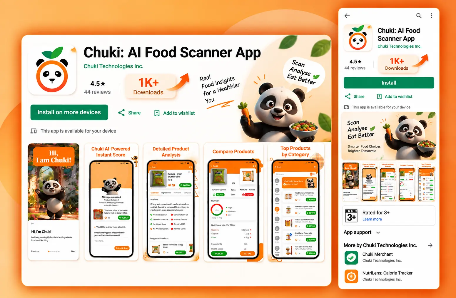
Live on Google Play at 1K+ downloads and a 4.5★ rating across 44 reviews.
01
Overview
The Chuki mobile app is where the scan actually happens: point the camera at a product, get a health score and an ingredient analysis back, and compare it against an alternative on the same shelf.
02
Context
The real usage context is a supermarket aisle — one hand on a trolley, indifferent lighting, a decision being made in seconds while someone waits behind you. That context sets every constraint in the design.
03
Challenge
Camera-first products have a hard first screen: the moment before anything is scanned. It has to explain itself without a tutorial, get out of the way immediately, and then deliver a verdict fast enough that scanning a second product still feels cheap.
04
Approach
An onboarding character does the explaining once, then never again. Results arrive as a single colour-coded verdict, with ingredients, nutrition and flags below it. Category browsing and side-by-side comparison cover the two things people do straight after their first scan.
05
What I did
- 01App UX flows: onboarding, scan, result, comparison, category browse
- 02Interface design across the core screens
- 03A mobile component and colour system consistent with the web product
- 04Store listing design — screenshots, feature graphic and listing narrative
- 05States nobody demos but everybody hits: no match found, poor lighting, offline
Live
See it working.
This project is live. The best version of any case study is the product itself.
Next project
My Hotelio