Healthcare App Design: How to Earn Trust
The short answer
Healthcare app design means making a health product people trust with sensitive data and find useful enough to reopen. Good health apps show value before asking for data, explain privacy beside the field that worries people, lead with a plain-language answer, and design for accessibility and the states nobody demos.
Key takeaways
- Most health apps lose people during onboarding or before their first useful result.
- Show value before sign-up, and split sensitive forms into short steps.
- Put the privacy explanation beside the field that causes worry, not in a policy page.
- Only 12% of US adults have proficient health literacy, so write results in plain words.
- Design for accessibility: about 16% of the world's population lives with disability.
Healthcare app design is the work of making a health product people trust enough to share sensitive data with, and find useful enough to open again next week. Most health apps fail at one of those two things. This guide covers what healthcare app design involves, why health apps lose users so fast, eight principles for earning trust, and how privacy rules show up in the interface.
What is healthcare app design?
Healthcare app design is the UX and interface work behind apps that track, explain or support someone's health: symptom and cycle trackers, nutrition scanners, telehealth, medication reminders and patient portals.
It differs from ordinary app design in three ways. The data is sensitive, sometimes stigmatised. The user is often anxious, unwell or reading slowly. And a misread screen can lead to a bad health decision, not just a lost sale.
Consumer and wellness apps sit at one end. Clinician-facing tools, used by doctors and nurses, sit at the other. The principles below apply to both, but the examples lean consumer, because that is where most new health products start.
Why do most health apps lose users so fast?
Because they ask for trust before they have earned it, and they don't deliver a useful result quickly enough.
The numbers are stark. A study in the Journal of Medical Internet Research tracked 93 mental health apps and found that a median of only 3.3% of users opened an app again 30 days after their first use. That figure is for mental health apps, but the pattern is familiar across health and wellness: people install with good intentions, hit a long sign-up form or a confusing first screen, and leave.
In my experience, health apps usually lose people in one of two places: during onboarding, or before they see their first useful result. Both are design problems.
What makes a healthcare app trustworthy?
These eight principles come from designing live consumer health apps, and from fixing the moments where users hesitated.
1. Show value before you ask for data. Let people use something real before they create an account. On Tanaya, a women's health app, the health FAQ library is open before sign-up, so the app proves it is useful before it asks for anything personal.
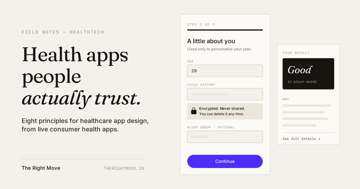
2. Put privacy where the worry happens. People don't read privacy policies. They hesitate at a specific field, such as weight, cycle history or a diagnosis. Put a one-line explanation of how that data is protected right next to that field. On Tanaya, the encryption note sits beside the fields that cause hesitation, not in a policy screen.
3. Ask in small steps. Split long health forms into short screens. Each step should feel quick and reversible. A two-step registration feels lighter than one long form, even when it asks for the same data.
4. Lead with the answer, then the reasoning. A health result should be readable at a glance and open to inspection. On Chuki, an AI food scanner, the scan gives one colour-coded verdict first, with ingredients, nutrition and flags one scroll below. Users get a fast decision without losing the detail.
5. Write for low health literacy. A US government brief found that only 12% of US adults had proficient health literacy. Medical terms, jargon and dense numbers lose most users. Use plain words, explain any term you must keep, and show what a number means for the person reading it.
6. Be clinical, not cold. Too clinical, and the app feels like a hospital form. Too soft, and it feels unqualified. The fix is usually a warm palette and voice on top of a precise, predictable structure.
7. Design for real bodies and real conditions. According to the WHO, over 1.3 billion people, about 16% of the world's population, live with disability. Health apps are used by people who are unwell, tired, older or using one hand. Follow WCAG 2.2, which sets a minimum target size of 24 by 24 CSS pixels for controls, use strong contrast, and support larger system text.
8. Design the states nobody demos. No result found. Poor lighting for a camera scan. No connection. A missing reading. These states happen every day, and in a health app a blank or confusing screen reads as "this app can't be trusted".
How do privacy laws like HIPAA and GDPR affect app design?
Privacy laws decide what you may collect and how. Design decides whether users understand and agree to it.
In the EU and UK, health data is a special category under GDPR. Article 9 prohibits processing data concerning health unless an exception applies, such as explicit consent for specified purposes. In the US, HIPAA applies to healthcare providers, insurers and the companies that handle data on their behalf, and many direct-to-consumer wellness apps fall outside it. Either way, users judge your app on whether it feels safe.
Formal compliance sign-off belongs to your legal and compliance advisers. The design job is to make their requirements clear on screen:
| Where privacy shows up | What good design does |
|---|---|
| Consent | Asks for each purpose separately, in plain words, with a clear yes or no |
| Sensitive fields | Explains why the data is needed and how it is protected, beside the field |
| Account creation | Delays sign-up until the user has seen value |
| Notifications | Keeps health details off the lock screen by default |
| Data controls | Makes export and delete easy to find, not buried in settings |
What are the most common healthcare app design mistakes?
- Registration before value. A long form on the first screen asks for trust the app hasn't earned.
- Privacy only in the policy. If the reassurance isn't next to the field, most users never see it.
- Jargon in results. A number without a plain-language meaning causes worry or gets ignored.
- Designing only the happy path. Missing, error and offline states look like failures in a health context.
- Mockups on a large, new phone. Real users have older phones, larger text settings and slower connections.
How I design health apps at The Right Move
My health work is consumer and wellness apps, each designed around a specific moment of hesitation. Chuki turns a dense nutrition label into one verdict for a shopper holding a trolley; it has 1K+ downloads and a 4.5★ rating. Tanaya handles questions people would rather not ask aloud, with privacy explained at the point of worry; it holds a 4.9★ rating, the highest in my portfolio. RiteFood is built around the week when most diet trackers get abandoned.
The full approach is on the HealthTech product design page, and the app engagement itself is on mobile app design. If you're still planning your first version, the MVP design checklist covers what to settle before you build.
Get a review of your health app
If people install your health app but don't come back, a focused review usually finds the drop-off point faster than a redesign. Book a UI/UX Consultation and bring your onboarding flow, or start a project.
By the numbers
- 3.3%
- Median share of users who reopened a mental health app 30 days after first use, across 93 appsJournal of Medical Internet Research, Baumel et al. 2019
- 12%
- Share of US adults with proficient health literacyU.S. Department of Health and Human Services, 2008
- 1.3 billion
- People living with disability worldwide, about 16% of the global populationWorld Health Organization
- 24×24 px
- Minimum touch target size for controls at WCAG 2.2 level AAW3C WCAG 2.2, via DAISY Consortium
Frequently asked questions
- How do you make a healthcare app users trust?
- Show value before asking for data, explain privacy beside the field that causes worry, use plain language, and lead every result with a clear answer. Trust comes from small, visible signals at each moment of hesitation, not from a privacy policy page.
- Does my health app need to be HIPAA compliant?
- Only if it handles health data for or on behalf of a provider, insurer or another HIPAA-covered entity. Many direct-to-consumer wellness apps fall outside HIPAA, but other laws such as GDPR may still apply. Confirm with a compliance adviser.
- Why do users stop using health apps?
- Most health apps lose users during onboarding or before the first useful result. A study of mental health apps found a median of only 3.3% of users returned 30 days after first use. Shorter sign-up and a faster first result help most.
- What accessibility standards should a healthcare app meet?
- Follow WCAG 2.2 at level AA: strong colour contrast, touch targets of at least 24 by 24 CSS pixels, support for larger system text, and labels that never rely on colour alone. Test with older users and people using one hand.
- How long does it take to design a healthcare app?
- A focused health app MVP usually takes six to ten weeks to research, design and test. Apps with several user roles, clinician tools or device integrations take longer.