Chuki
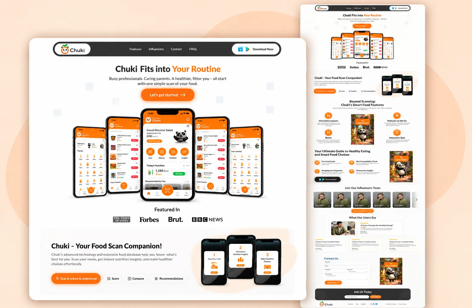
The problem
A scanner app can only be found by people already in an app store. The product had no surface a search engine, a journalist or a first-time visitor could reach — and no way to explain what its health score actually means before someone commits to an install.
The solution
A web product that does the explaining: the score as the primary object, the ingredient and nutrition analysis directly beneath it, and a download path placed after the value is understood rather than before it.
The result
A public, indexable front door for the product, sharing one component and colour system with the app so the two never drift apart.
01
Overview
Chuki is an AI food scanner. You scan a packaged product and it returns a health score out of 100, colour-coded, backed by an ingredient and nutrition breakdown. This is the web side of that product.
02
Context
The scanner lives on mobile first — that is where the camera is. The web product has a different job: to explain what the score means, to make the analysis readable on a larger screen, and to give the product a surface that search engines and new users can actually reach.
03
Challenge
A health score is a single number standing in for a lot of underlying data. Show only the number and people do not trust it. Show all the data and nobody reads it. The interface had to make the score feel immediate and inspectable — confident at a glance, defensible underneath.
04
Approach
The score is the primary object on the page: large, colour-coded, unambiguous. Everything that justifies it — ingredients, nutrition facts, the flags that moved the number — sits directly beneath it as progressive disclosure. Colour carries meaning consistently across the whole product, so red, amber and green never have to be re-learned.
05
What I did
- 01Product and UX structure for the web experience
- 02Interface design for the score, ingredient breakdown and nutrition detail
- 03A component system shared across both product surfaces
- 04Responsive front-end implementation
- 05Accessible colour treatment, so the rating never depends on colour alone
Live
See it working.
This project is live. The best version of any case study is the product itself.
Next project
Chuki App