Fylext
The problem
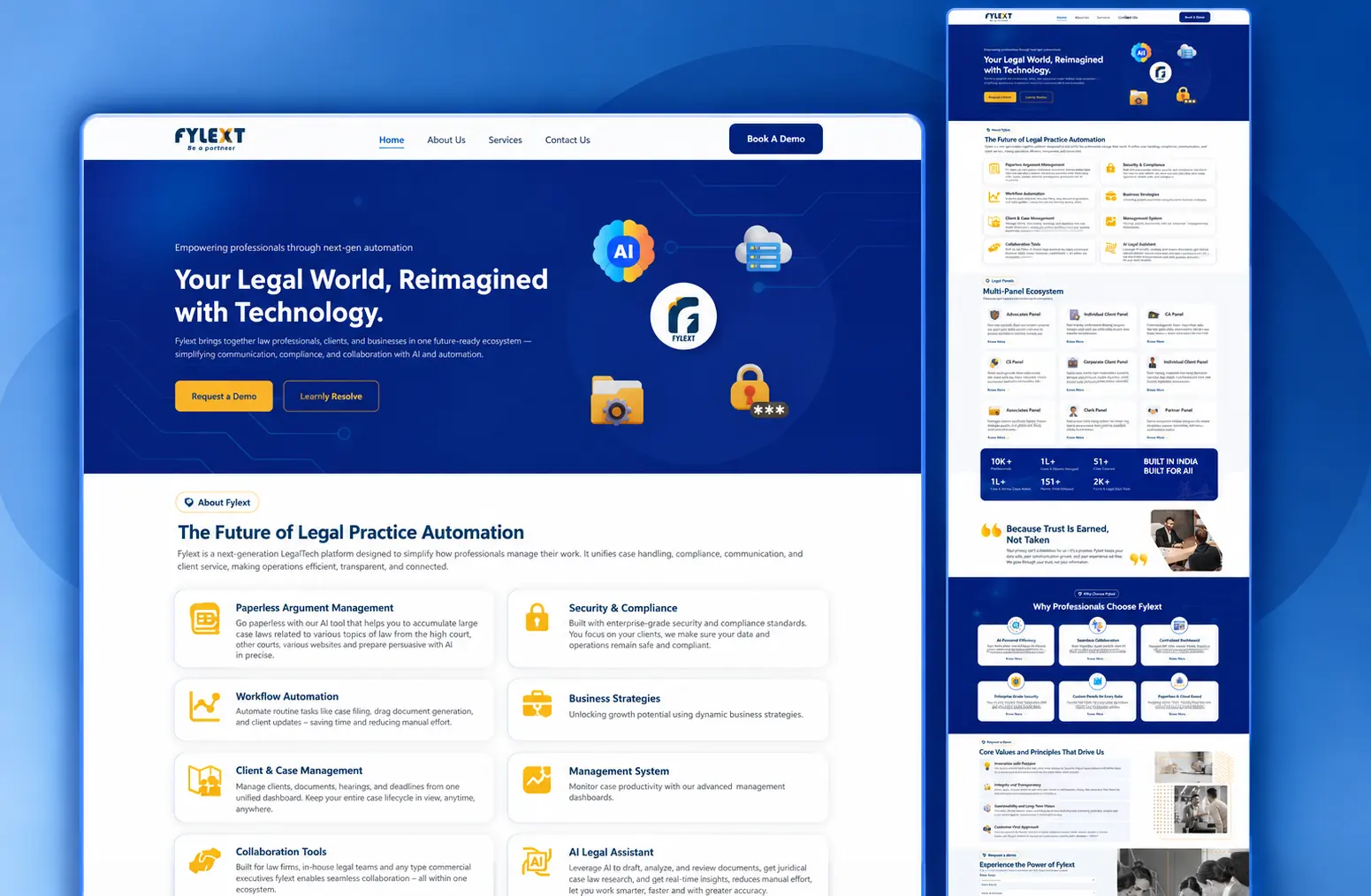
Fylext is not one product — it is a panel each for advocates, individual clients, CAs, corporates, associates, clerks and partners. Described in full it reads as a feature dump; described simply it sounds like every other legal CRM.
The solution
A page that leads with the single sentence the whole platform reduces to, then opens into capability cards, then into the panel ecosystem — so a visitor self-selects into their own panel instead of reading about seven others.
The result
A product site where a specialist audience reaches its own use case in two scrolls, and a demo request comes after comprehension rather than instead of it.
01
Overview
Fylext is a legal-practice automation platform: paperless argument management, workflow automation, client and case management, collaboration tools and an AI legal assistant, delivered as a separate panel for each kind of user.
02
Context
The audience is professionally sceptical and time-poor. Lawyers evaluate software the way they evaluate a contract — looking for what it does not say. Overclaiming loses the room faster than underclaiming.
03
Challenge
The proposition is technically real and genuinely broad, which is exactly what makes it hard to communicate. Complexity had to stay visible — a law firm needs to see that compliance and security were considered — without the page becoming an unreadable specification.
04
Approach
A layered structure. One sentence at the top that the entire platform reduces to. Below it, capabilities as evenly weighted cards, so nothing is buried and nothing is oversold. Below that, the multi-panel ecosystem laid out explicitly, so each visitor can find the panel that is theirs. Trust material — security, compliance, principles — is placed where a sceptical reader looks for it rather than in a footer.
05
What I did
- 01Content architecture and page structure
- 02Interface and visual design across the marketing surface
- 03Card, panel and section patterns that hold a wide feature set
- 04Responsive front-end implementation
- 05Conversion routes for each of the platform's audiences
Live
See it working.
This project is live. The best version of any case study is the product itself.
Next project
LegalMeet