BCIPL Admissions
An admissions page built to be answered, not admired.
The problem
A student choosing a GST, Tally or mutual-fund course is choosing whether to trust an institute with a year and a fee. Course lists do not answer that. Placement outcomes and a person to talk to do.
The solution
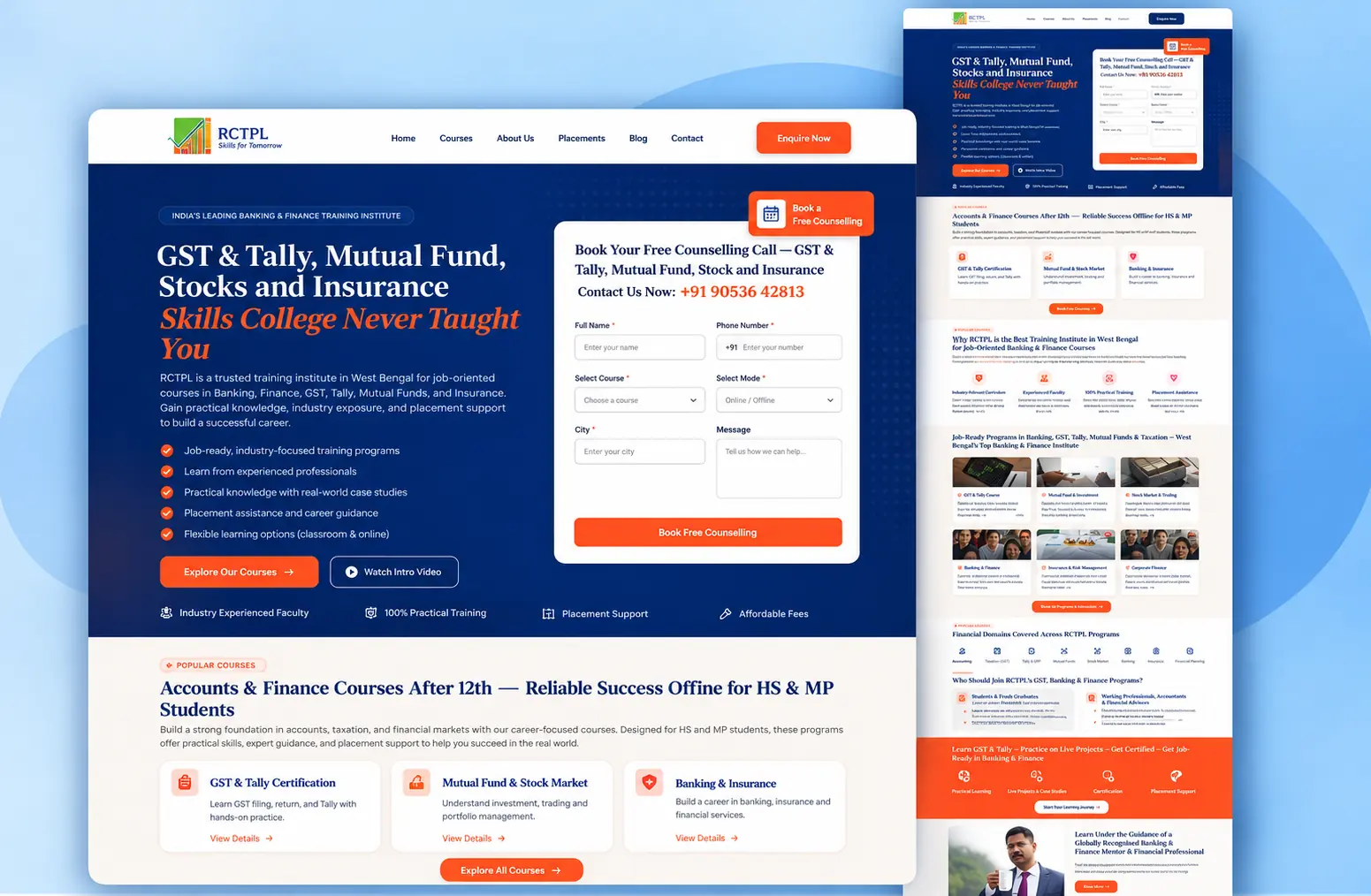
A page built backwards from the counselling call: the form is above the fold and beside the pitch, not at the bottom; the proposition names the gap the course fills; and every subsequent section — course cards, faculty, placement support, live projects — exists to make booking that call feel lower-risk.
The result
An admissions surface leading with what the institute can actually evidence: 1,125+ students placed, ISO 9001:2015 certification, three West Bengal campuses and online delivery across India.
01
Overview
BCIPL — Bijoy Capital Institute of Professional Learning — runs job-oriented training in GST and Tally, mutual funds, stock markets, banking and insurance, across three campuses in West Bengal and online across India. This is its admissions page.
02
Context
The visitor is usually a commerce student just out of school, a graduate who has discovered their degree is not job-ready, or a professional switching into finance. All three are anxious about the same thing: does this end in a job.
03
Challenge
An admissions page is measured on one number — enquiries — and the enquiry costs the visitor something: a phone number, and the expectation of a sales call. Everything on the page has to reduce the perceived cost of that step.
04
Approach
The counselling form sits beside the proposition in the first screen, not at the end of a scroll, with the phone number stated in the open for anyone who would rather call than type. The headline names the gap rather than the syllabus — the skills college never taught you. Below it, credibility is stacked in the order a nervous buyer asks for it: what you will learn, who teaches it, who got placed, what it costs to start.
05
What I did
- 01Conversion structure for the admissions journey
- 02Interface and visual design for the landing page
- 03Enquiry form design, including the fields worth asking for and the ones that cost conversions
- 04Course, faculty and placement-proof patterns
- 05Responsive implementation for a majority-mobile audience
Live
See it working.
This project is live. The best version of any case study is the product itself.
Next project
Farmology